Monday, 11 February 2013

Contents Page Analysis Mojo

Here is 2 examples of contents pages from the magazine mojo. Mojo, like NME sticks to a set pattern throughout their contents pages to create house style.
Mojo however does not contain advertising in their contents pages. Whereas NME has one main image, Mojo has lots of smaller images which usually relate to the text and picture on the cover. Mojo has the magazine title in their contents page too, again this will act as a reminder to what the audience is reading. The main cover lines are used to categorise the contents and make for easy navigation. 
I believe Mojo's contents page design is a better design than NME and i have chosen to take inspiration from Mojo for my own magazine. Mojo's is better as the clutter of images gives it a youthful sense, which would be my main audience. It also sticks to a black and white colour scheme which seems sophisticated.

Thursday, 7 February 2013

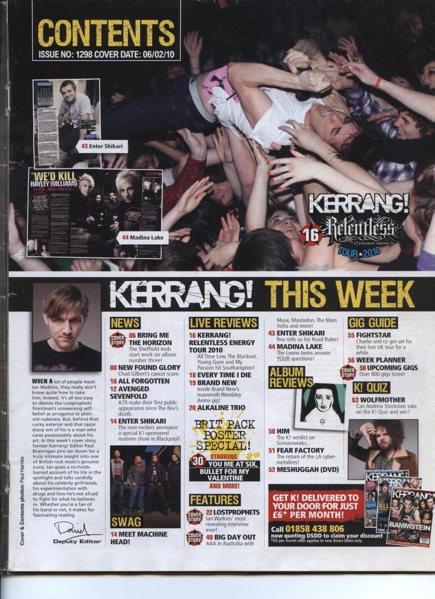
Contents Page Analysis Kerrang


The same as Mojo and NME, Kerrang employs a similar design in all of their contents page to create house style. The idea behind this is to get the reader familiar with the magazine straight away. It also makes it seem more patterned and professional rather than random chaos. I do not like Kerrang's as much as it's smashed effect on the typography and yellow and black connoting danger inside gives it a childish sense. This would not appeal to my target audience of late teens to mid 20s.

Contents Page Analysis NME


This is another contents page by NME, they tend to use the same template which could get repetitive for frequent readers but overall is a good design. It is very clear and simple and offers a brief insight to the rest of the magazine                                                                                   

Tuesday, 5 February 2013

College Magazine Photos

I will not be using this photo as even though the quality is acceptable the shot is very bare and boring. There isn't many things associated with education. these would be books or paper.


I am not going to use this photo as there are people in the background and the shot itself is too casual and sociable rather than hardworking.

I will be using this photo as connotes college life of doing your work on your own. It looks smart and formal. This photo is a medium shot which is perfectly suited for a magazine cover. It is also a high angle shot.
This is not going to be used as it is blurry and too informal.


I am not using this last shot as although it has the connotations of education I feel as if a photo with writing on paper would be better suited

Monday, 4 February 2013

College Magazine Cover Analysis


This college magazine is simply called college guide. The title of the magazine is, 'College Preparation: Navigating The Maze' This is noticeable due to it being the first text below the masthead. It is also in the same colours as the masthead. This suggests you should pay attention to this first. The main image is of a student working on a bench with students in the background reading. This is clearly relevant to the contents of the magazine as it is a college magazine. It is a guide so this suggests it will be helping you with work. The target audience is of students of the college. These would be 16-20 year olds both male and female. The magazine is aimed at these as the magazine is to help its students get through successfully as the title suggests.

Codes And Conventions
The magazine uses the MASTHEAD, 'College Guide'
The magazine also uses SELL LINES for example, 'Special Insert Section' 'Special' could also be seen as a BUZZWORD. The magazine has used a MAIN HEADLINE of, 'College Preparation: Navigating The Maze' The magazine uses HOUSE STYLE in its masthead and sell line. This is because it uses the same colours which is traditional to the magazine. The magazine does not use many of the codes and conventions of a typical magazine such as:
SLOGAN
ANCHORAGE TEXT
BANNER
STRAP LINE
Images and Camera Shots/Angles
There is a medium shot of a girl working at a bench. A focus pull is used to blur the background of otherstudents working. This relates to the audience as it is what they should be doing at college.

Mise-en-scene
There is a girl with pen and paper on a bench working. The girl is smiling. This relates to the readers and the magazine content. The readers will go to the college and the magazine is about easily doing your work and should be happy while doing it.

Cover - Audience Engagement
The magazine cover engages the audience using a variety of text and its main image. The girl in the image is looking directly at the camera as if she is looking at you. She is also doing school work which speaks to what the target audience will be familiar with within the college. 
An example of the text used is, 'Local Students Share Test Taking Tips' this is also familiar with the target audience. This is because they will all be going through similar struggles and makes the magazine more personal.
Target Audience
The target audience would be students of the college. These people will be both male and female of the age 16-20. You know this is the target audience as the magazine is a guide to the college. These people will be going to the college. the cover also features a girl of this age. This also makes the magazine more personal, as you can relate to this as they could easily be your friends.
Ideology
The ideology of the magazine would be to get through to its students to promote good work and dedication. The main goal of the magazine would be to be extra help to the students so that they can get through college with the best grades. The contents of the magazine will most likely promote extra curricular activities such as revision to help with exams. This is suggested with the 'Online Resources For College Planning' text on the cover.
Helping With My Final Production
This will help me with the production of my own magazine as i can take some of the ideas from this magazine and use it on my own. Examples of this would be that I will create house style and use a personal image that would connect with the audience. This magazine does not contain many of the codes and conventions of a typical magazine. 
This could be seen as a drawback as it will not have done the most it can to make people want to have it, this maybe makes it less professional. However it could be that it has adopted a more simplistic approach as it is a college magazine, it would not want to overload the student audience. From this i'll take for my final product to make sure i use the typical codes and conventions, but also try to make it simplistic.

Friday, 1 February 2013

Using Photoshop

To begin using Photoshop I first of all made sure that the preset was 'International Paper'
 Next I made sure to use the colour mode 'RGB Color'
 I then started with the image of the artist, 'Jay Z'
 I manipulated the image by using the 'Magic Wand Tool' after selecting 'Rasterize Layer' so i was able to work on the image. I used the magic wand tool to delete the background of the image by selecting colours.
 I then used an image of a dark alley to place behind the artist. Originally the artist was covered by the background but i dragged the layer the artist was on to the top so it was in front.

 I then used a different background to create contrast.
 For the next one I used the 'Healing brush tool' to remove the spots of the models forehead to make her look better. The last one is an image of Scarlett Johansson I adjusted the layer to black and white. Be fore that I had selected her mouth and made it a different layer. Again I used the magic wand tool to remove the background skin. After these processes I placed the red lip layer in front of the black and white image.