
Tuesday, 12 February 2013


Double Page Analysis Kerrang

The mise en scene is just the members of the band with a blank background. Most of them have long hair to fit in with the punk rock genre. The front man is wearing blue which links with the colour theme
Headline:
There isn't a title in itself. Instead a pulled quotation is used. This is used to quickly engage with who the article is about.
Text:
The text is in columns to the left side and there isn't very much. This says that the double page spread is very basic and minimal. The text is easy to read as it is white on a black background.
Colour theme:
The main colours used are red, blue and black. The pulled quotation is in red to clearly be visible to the reader. The logo on the top left is in blue and the background to the text is black. The colour theme even stays in the mise en scene of the main image. The front man is wearing a blue jacket and has red hair.
Image:
The image is very basic, but is also clever. The image links with the colour theme with what the band members are wearing. As the image is just the band, it will quickly resignate with the fans of the band.
Target Audience:
The target audience of this article would be between mid teens to early twenties. They could be of either sex but mainly male. This is because they would be interested in that genre of music and that band.
Monday, 11 February 2013
Contents Page Analysis Mojo

Mojo however does not contain advertising in their contents pages. Whereas NME has one main image, Mojo has lots of smaller images which usually relate to the text and picture on the cover. Mojo has the magazine title in their contents page too, again this will act as a reminder to what the audience is reading. The main cover lines are used to categorise the contents and make for easy navigation.

Thursday, 7 February 2013
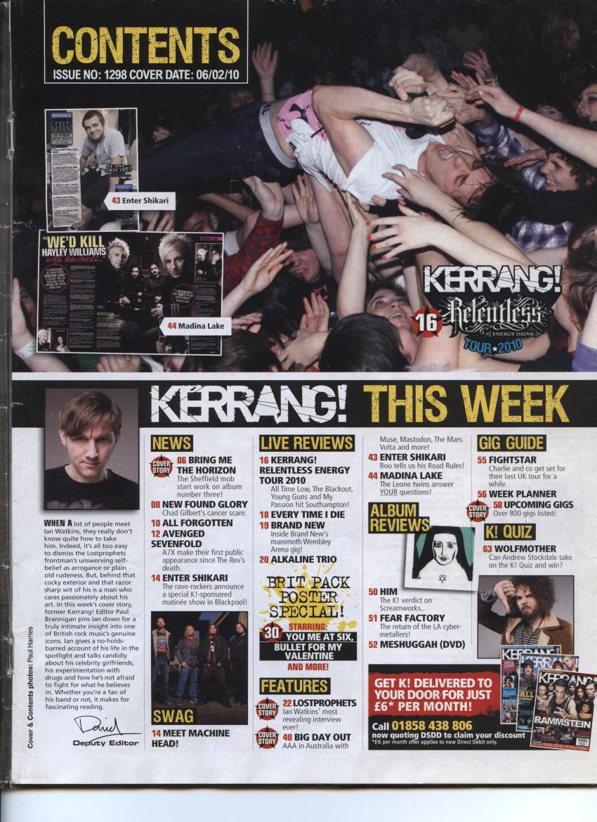
Contents Page Analysis Kerrang

Contents Page Analysis NME

 This is another contents page by NME, they tend to use the same template which could get repetitive for frequent readers but overall is a good design. It is very clear and simple and offers a brief insight to the rest of the magazine
 Wednesday, 6 February 2013

Subscribe to:
Posts (Atom)